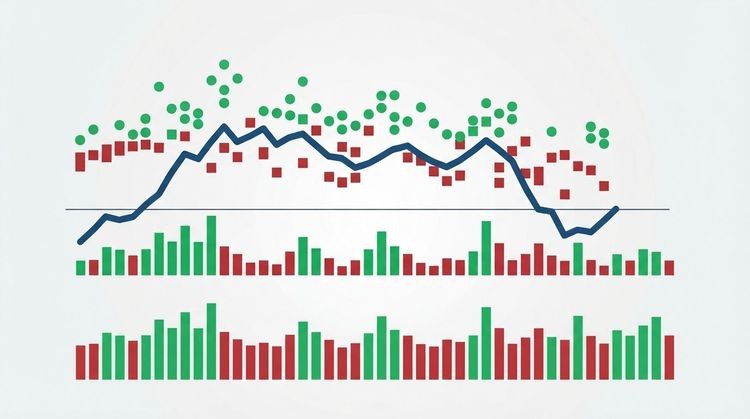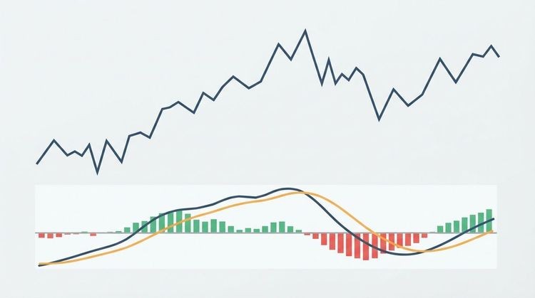


A stock indicator chart is a price chart layered with technical indicators that convert raw price and volume data into readable signals. Your immediate next step: pick 2–3 complementary indicators, a trend tool plus a momentum oscillator and optionally a volume confirmator, and add them to a live chart right now.
Quick-start checklist:
- Pick your timeframe (daily for swing trading, 5–15 min for day trading, weekly for long-term)
- Choose your chart type (candlestick for most traders, line for portfolio-level trend checks)
- Add 2–3 indicators: one trend, one momentum, one volume
Table of Contents
- What does a stock indicator chart actually show you?
- Which chart type should you use?
- What are the main indicator categories?
- How do you add and customize indicators on a chart?
- How do you read indicator signals on a chart?
- Research-backed best practices for choosing indicators
- Practical indicator setups by trading style
- How to view indicators and set alerts with Handy Markets
- Key Takeaways
- The indicator trap most traders fall into
- See your indicators live on Handy Markets
- Useful sources and further reading
What does a stock indicator chart actually show you?
Every chart has two zones. The price pane sits at the top and holds the main price series plus any overlays, such as moving averages, that plot directly on price. Below it, one or more indicator panes display oscillators like RSI and the MACD histogram, each with its own axis and scale.
Common elements you will see on any technical analysis chart:
- Price series: line, bar, or candlestick depending on the chart type you choose
- Volume bars: usually displayed at the bottom of the price pane as a histogram
- Indicator lines/histograms: plotted in separate panes for oscillators; overlaid for moving averages
- Scale type: linear (equal dollar steps) vs. logarithmic (equal percentage steps, better for long-term charts)
- Time axis: the horizontal axis; timeframe determines how much history each bar represents
Every indicator has at least one input you can adjust: period/length (how many bars to look back), source price (close, high, low, or typical), and smoothing type (simple, exponential, weighted). Defaults like 14-period RSI or 20-period Bollinger Bands are widely used because they balance responsiveness with noise reduction.
The VIX is a useful example of a non-price indicator. According to S&P Dow Jones Indices, the VIX measures 30-day implied volatility for the S&P 500 using options with 23–37 days to expiration, and readings above 30 typically signal high expected volatility.
| VIX Range | Market Interpretation |
|---|---|
| Low range | Indicates low volatility and calm market conditions |
| Moderate range | Indicates moderate volatility and a normal trading environment |
| Elevated range | Signals increased caution due to higher volatility |
| High range | Reflects high volatility and the potential for wide price swings |
Statistic callout: VIX readings above 30 indicate high expected volatility in the S&P 500, per S&P Dow Jones Indices methodology.
Which chart type should you use?
The chart type you pick shapes how clearly you can read price action and indicator signals together. Here is how the three main types compare:
| Chart Type | Best For | Key Limitation |
|---|---|---|
| Line chart | Long-term trend visualization, portfolio checks | Hides intraday open/high/low detail |
| Bar chart | Intraday pattern work, OHLC detail | Harder to read quickly than candlesticks |
| Candlestick | Entry/exit timing, reversal patterns, most trading | Can feel busy on very short timeframes |
Line charts connect closing prices and smooth out noise, making them ideal for spotting a multi-month trend at a glance. Bar charts show the open, high, low, and close for each period, which is useful for intraday work. Candlestick charts display the same four data points but color-code each bar, making bullish and bearish sessions immediately obvious. Most active traders default to candlesticks because reversal patterns like engulfing bars and doji formations are far easier to spot.
Timeframe alignment matters here too. A daily candlestick chart pairs naturally with 14-period RSI and a 50-day EMA. A 5-minute chart for day trading calls for shorter periods and faster indicators.

Pro Tip: Use candlestick charts for entry and exit decisions, then switch to a weekly line chart to confirm you are trading in the direction of the larger trend.
What are the main indicator categories?
Technical indicators fall into four categories, and understanding what each category measures helps you build a balanced setup rather than stacking redundant tools.
Trend indicators tell you the direction and strength of the prevailing move:
- SMA (Simple Moving Average): averages closing prices over a set period; the 50-day and 200-day SMAs are widely watched support/resistance levels
- EMA (Exponential Moving Average): weights recent prices more heavily, reacts faster to new moves
- ADX (Average Directional Index): measures trend strength on a 0–100 scale; readings above 25 suggest a strong trend is in place
Momentum indicators measure the speed and strength of price changes:
- RSI (Relative Strength Index): oscillates 0–100; above 70 is conventionally overbought, below 30 is oversold
- MACD: plots the difference between two EMAs plus a signal line; crossovers and histogram direction are the primary signals
- Stochastic Oscillator: compares a closing price to its range over a set period; useful for spotting short-term exhaustion
Volume indicators confirm whether price moves have conviction behind them:
- OBV (On-Balance Volume): adds volume on up days, subtracts on down days; rising OBV with rising price confirms buying pressure
- Accumulation/Distribution (A/D): weights volume by where price closes within the day’s range, giving a more nuanced picture than OBV alone
Volatility indicators show how much prices are moving relative to recent history:
- Bollinger Bands: two standard-deviation bands around a 20-period SMA; a squeeze (bands narrowing) often precedes a breakout
- VIX: the market’s “fear gauge,” useful as a macro backdrop rather than a single-stock signal
For beginners, a practical short list of best stock indicators to start with:
| Indicator | Primary Use |
|---|---|
| 50-day EMA | Identify trend direction |
| RSI (14) | Spot overbought/oversold conditions |
| MACD (12/26/9) | Confirm momentum and crossovers |
| OBV | Validate price moves with volume |
| Bollinger Bands | Gauge volatility and potential breakouts |
How do you add and customize indicators on a chart?
Adding indicators is straightforward in any modern charting tool. Follow these steps:
- Open your chart and select the asset you want to analyze.
- Set the timeframe that matches your trading horizon (daily, hourly, 5-minute).
- Choose your chart type — candlestick for most use cases.
- Add an overlay indicator (e.g., EMA) directly onto the price pane via the indicator menu.
- Add an oscillator (e.g., RSI or MACD) to a new indicator pane below the price chart.
- Configure the settings: adjust period/length, source price, and colors.
- Save the layout as a template so you can reload it instantly on any other asset.
Key settings to review before you finalize any indicator:
- Period/length: the default 14 for RSI and 20 for Bollinger Bands are sensible starting points; shorter periods react faster but generate more false signals
- Source price: most indicators default to the closing price; some traders use the “typical price” (high + low + close ÷ 3) for smoother readings
- Smoothing type: EMA smoothing weights recent data more than SMA; choose based on how quickly you need the indicator to respond
- Colors and visibility: use contrasting colors when overlaying multiple moving averages so you can read crossovers at a glance
- Axis scaling: check whether your oscillator’s axis is fixed (RSI: 0–100) or auto-scaled, since auto-scaling can distort visual readings
Pro Tip: Save at least two templates: one for your primary trading style and one for a quick macro check (weekly chart + 200-day SMA + VIX overlay). Switching between them takes seconds and keeps your analysis consistent.
How do you read indicator signals on a chart?
Signals fall into four main types, and knowing how to combine them separates useful analysis from noise.

Crossovers are the most visible signal. When a shorter-period moving average crosses above a longer one (a “golden cross” on the 50/200-day SMAs), it suggests upward momentum is building. The MACD line crossing above its signal line gives a similar read on a shorter timeframe. The catch: crossovers lag because they are based on historical averages. Confirming a crossover with rising OBV or an expanding MACD histogram reduces false entries.
Divergence occurs when price and an indicator move in opposite directions. If a stock makes a new high but RSI makes a lower high, that negative divergence warns that momentum is fading even as price climbs. The advance/decline line works the same way at the market level: when the A/D line diverges from an index, it can signal that the rally lacks broad participation.
Overbought/oversold readings from RSI or Stochastics are most reliable when read in context. An RSI above 70 in a strong uptrend often stays elevated for weeks; the same reading in a choppy, range-bound market is a more actionable reversal signal. Always check the trend direction first.
Squeezes and breakouts with Bollinger Bands: when the bands narrow sharply, volatility has compressed and a large move is likely coming. The direction is not predetermined, so traders watch for a candle closing outside the bands plus a surge in OBV to confirm the breakout direction.
Before acting on any single-stock signal, compare the stock’s chart to the S&P 500 or its sector index. If the whole market is selling off, a bearish RSI reading on one stock tells you very little about that stock specifically.
A short example: imagine a mid-cap stock where the 50-day EMA crosses above the 200-day EMA. OBV has been rising for three weeks alongside price. RSI sits at 58, not yet overbought. The S&P 500 benchmark is trending higher. That confluence of signals is far more meaningful than any single crossover in isolation.
Pro Tip: Check the Fear & Greed Index before entering a position. Extreme fear or greed readings suggest the market is emotionally driven, which can make indicator signals less reliable than usual.
Research-backed best practices for choosing indicators
The core principle is simple: fewer, complementary indicators outperform a crowded chart. Stacking five momentum oscillators does not give you five times the insight; it gives you five versions of the same signal, plus contradictions that make decisions harder.
Practitioners typically pair a trend indicator, a momentum oscillator, and a volume confirmator. This combination covers multiple dimensions of price behavior without overlap.
Dos:
- Combine indicators from different categories (trend + momentum + volume)
- Align indicator periods with your trading timeframe
- Confirm signals with a market benchmark comparison before acting
- Paper trade a new setup for at least two to four weeks before using real capital
Don’ts:
- Add more than three to four indicators to a single chart
- Use two momentum oscillators simultaneously (e.g., RSI and Stochastics together) without a clear reason
- Optimize indicator settings to fit past data perfectly — that is overfitting, and it rarely holds in live markets
- Ignore the broader market context when reading single-stock signals
| Approach | Result |
|---|---|
| 2–3 complementary indicators | Cleaner signals, fewer contradictions |
| 5+ indicators, same category | Redundant signals, decision paralysis |
| Indicators without volume confirmation | Higher false-positive rate |
| Benchmark-confirmed signals | Better separation of stock vs. market moves |
Pro Tip: Build a “paper trade journal” for each new indicator setup. Log the signal, the entry, the exit, and whether the benchmark confirmed the move. After 20 trades, patterns in your own decision-making become obvious.
For a deeper look at how market indicators work together, the Handy Markets blog covers research-backed approaches to minimizing noise.
Practical indicator setups by trading style
Different trading styles call for different indicator combinations and timeframes. Here are three ready-to-use templates.
- Trend-following: 50-day EMA + 200-day EMA + ADX + OBV on a daily chart. Enter when the 50 EMA is above the 200 EMA, ADX is above 25, and OBV is rising. Exit when ADX drops below 20 or the 50 EMA crosses back below the 200.
- Swing trading: 9/21 EMA ribbon + RSI (14) + MACD (12/26/9) on a daily or 4-hour chart. Enter on a bullish EMA crossover confirmed by RSI above 50 and a positive MACD histogram. Place a stop below the most recent swing low.
- Day trading: 9 EMA + 20 EMA + VWAP + Stochastic (14,3,3) on a 5- or 15-minute chart. Trade in the direction of VWAP; use Stochastic crossovers near oversold levels as entry triggers. Exit before major news events or at a 1:2 risk/reward target.
| Trading Style | Chart Type | Key Indicators | Timeframe |
|---|---|---|---|
| Trend-following | Candlestick | 50/200 EMA, ADX, OBV | Daily, Weekly |
| Swing trading | Candlestick | 9/21 EMA, RSI, MACD | Daily, 4-hour |
| Day trading | Candlestick | 9/20 EMA, VWAP, Stochastic | 5-min, 15-min |
Pro Tip: Test every template on at least three months of historical chart data before trading it live. Look for the conditions where it fails, not just where it works.
For a full breakdown of how to monitor stocks across these setups, the stock monitoring guide on Handy Markets walks through a practical workflow.
How to view indicators and set alerts with Handy Markets
Handy Markets brings live stock charts, saveable indicator templates, and multi-channel price alerts together in one place. Here is how to put the guide into practice on the platform.
Step-by-step walkthrough:
- Go to the Stocks page and open any stock’s chart.
- Select your timeframe (daily, hourly, or intraday) from the chart toolbar.
- Choose your chart type: candlestick is the default and recommended starting point.
- Open the indicator menu and add your chosen overlays (e.g., 50-day EMA) and oscillators (e.g., RSI, MACD).
- Adjust period, source price, and colors in each indicator’s settings panel.
- Save the layout as a named template so you can apply it to any other stock instantly.
- Set a price alert tied to a key level or indicator condition, then choose your delivery channel.
Alert channels available on Handy Markets:
- Telegram
- Discord
- Slack
- SMS
- Webhook
This means you can get notified the moment a stock crosses a moving average or hits a price level you have been watching, without staying glued to a screen.
| Feature | What It Does |
|---|---|
| Live stock quotes | Real-time price data for chart analysis |
| Indicator overlays | Add EMA, Bollinger Bands, and more to the price pane |
| Oscillator panes | RSI, MACD, Stochastic in separate chart panes |
| Saveable templates | Reload your indicator setup on any asset instantly |
| Multi-channel alerts | Push notifications via Telegram, Slack, SMS, and more |
Pro Tip: Set alerts at technically significant levels, such as a price touching the 200-day EMA or RSI crossing 70, rather than arbitrary round numbers. Those levels already carry meaning for other traders watching the same chart.
Key Takeaways
Combining 2–3 complementary indicators from different categories, confirmed by volume and a market benchmark, gives you cleaner signals and fewer false entries than any single-indicator approach.
| Point | Details |
|---|---|
| Use 2–3 complementary indicators | Pair trend, momentum, and volume tools to cover distinct dimensions without redundancy. |
| Align timeframe to your style | Daily charts suit swing trading; 5–15 minute charts suit day trading; weekly charts suit trend-following. |
| Confirm signals with volume and benchmark | Rising OBV and a confirming S&P 500 trend reduce false-positive entries significantly. |
| Indicators lag by design | All indicators are built on past data; treat signals as probabilities, not predictions. |
| Handy Markets for live setups | Use Handy Markets to add indicators, save templates, and receive multi-channel alerts on any stock. |
The indicator trap most traders fall into
Most traders who struggle with technical analysis are not using the wrong indicators. They are using too many of them. We have seen this pattern repeatedly in how traders approach charting: a clean setup with a 50-day EMA, RSI, and OBV is almost always more useful than a chart buried under six oscillators, two volume tools, and three moving averages.
The deeper issue is that indicators are not predictive. They are descriptive. They tell you what has happened to price and volume, and they help you identify conditions that have historically preceded certain outcomes. That is genuinely useful, but it is not a crystal ball. When the VIX spikes above 30 and the broader market is in a sharp drawdown, even a textbook-perfect bullish crossover on a single stock deserves skepticism.
The traders who get the most out of technical analysis charts tend to treat indicators as a checklist, not a trigger. They ask: does the trend confirm? Does volume confirm? Does the broader market confirm? When three of those answers are yes, they act. When only one is yes, they wait.
See your indicators live on Handy Markets
Real-time data changes how you read indicator signals. Watching a live RSI approach 70 while OBV is still climbing is a very different experience from studying a static screenshot, and that difference matters when you are deciding whether to act.
Handy Markets gives you live stock charts with indicator overlays, saveable templates you can reload in one click, and price alerts delivered to Telegram, Slack, SMS, webhook, or email the moment a level is hit. You do not need to monitor a screen all day to stay on top of your setups.
Set up your first indicator template on the Stocks page, then create a price alert tied to a key technical level. It takes under five minutes, and you will have a live, working version of everything covered in this guide.
Useful sources and further reading
The sources below informed this guide and are worth bookmarking for deeper study.
- Top 7 Technical Analysis Tools — Investopedia: Covers indicator categories, the 2–3 indicator rule, and OBV signal interpretation.
- Using Technical Analysis — Fidelity: Practical signal descriptions, benchmark comparison methodology, and chart examples for retail traders.
- Advance/Decline Indicator — Fidelity: Explains market breadth and how the A/D line confirms or warns against price rallies.
- VIX Introduction — S&P Dow Jones Indices: Authoritative methodology for VIX calculation, range interpretation, and implied volatility context.
- Fear & Greed Index — CNN: Aggregates momentum, volatility, and sentiment metrics to flag extreme investor emotions.
- Handy Markets Blog — Stock Market Indicators: Practical notes on combining indicators and building a starter toolkit.
- Handy Markets — Stocks Page: Live quotes, charts, and indicator tools for U.S. stocks with multi-channel alert setup.
This article is general educational information, not investment or financial advice. Confirm any trading approach with a qualified financial professional and verify current market conditions before acting.