

TL;DR:
- Price correlation measures how two assets move together, with values from -1 to +1 indicating opposite or same-direction movement. It is most reliable when calculated on returns over at least three years and monitored with rolling windows to account for market changes. Correlation should be used alongside other tools for smarter portfolio management and trading decisions.
Price correlation is defined as a statistical measure that quantifies how two asset prices move in relation to each other, expressed as a coefficient from +1 to -1. A reading of +1 means the assets move in perfect lockstep. A reading of -1 means they move in exactly opposite directions. Understanding what is price correlation gives traders and investors a concrete tool for building smarter portfolios, spotting risk clusters, and designing trading strategies grounded in data rather than instinct. The standard metric for this measurement is the Pearson correlation coefficient, and it applies across stocks, bonds, commodities, forex pairs, and cryptocurrencies.
What is price correlation and how is it calculated?
The Pearson correlation coefficient measures the linear relationship between the returns of two assets. You calculate it by dividing the covariance of the two return series by the product of their standard deviations. The result always falls between -1 and +1, giving you a clean, comparable number regardless of the asset class.

One critical detail: always calculate correlation using returns, not raw price levels. Raw prices drift upward over time due to general market trends, which creates false correlation signals. Daily or weekly percentage returns strip out that drift and capture true day-to-day co-movement.
Data length matters as much as the formula. Robust correlation analysis requires at least 3 years of historical price data. Shorter windows can produce misleading readings, especially if the sample period covers only one market regime.
Interpreting the coefficient
| Coefficient range | Interpretation |
|---|---|
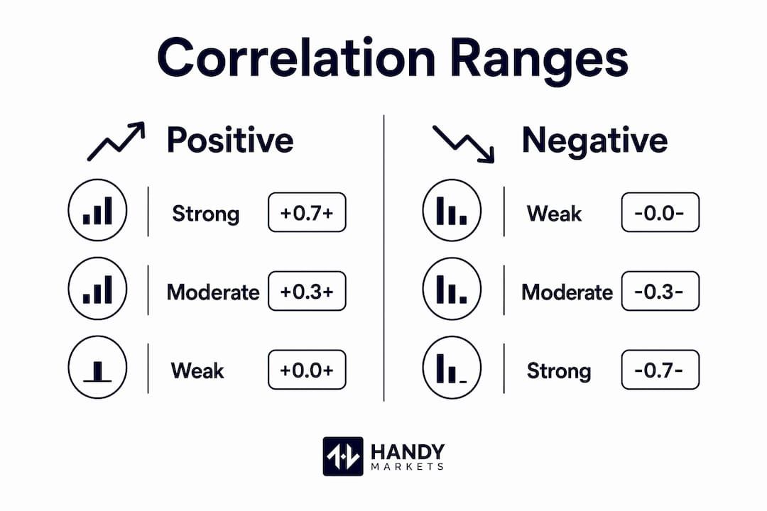
| +0.7 to +1.0 | Strong positive correlation |
| +0.3 to +0.69 | Moderate positive correlation |
| -0.29 to +0.29 | Weak or no correlation |
| -0.3 to -0.69 | Moderate negative correlation |
| -0.7 to -1.0 | Strong negative correlation |
Strong correlations are generally defined as coefficients above +0.7 or below -0.7. These thresholds signal that two assets move closely enough together, or inversely enough, to support strategies like pairs trading or portfolio hedging.
Pro Tip: Calculate correlation on at least 60 trading days of return data before drawing any conclusions. Fewer data points produce noisy, unreliable coefficients.
What are the limitations and dynamic nature of price correlation?
Correlation is not a fixed number. It changes with market conditions, economic events, and shifts in investor behavior. A pair of assets that showed a strong negative correlation during a bull market may suddenly move together during a liquidity crisis. Treating any correlation reading as permanent is one of the most common mistakes traders make.
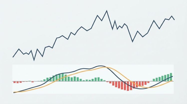
Rolling correlations address this problem directly. A rolling correlation window of 20, 60, or 120 trading days recalculates the coefficient continuously as new data arrives. This approach reveals how the relationship between two assets evolves over time, rather than locking you into a single static number.
The Pearson coefficient also has a structural limitation worth knowing. It only detects linear relationships between assets. Two assets can have a strong nonlinear relationship that Pearson entirely misses. For those situations, the Spearman rank correlation is a better tool. It detects monotonic relationships and handles outliers more effectively than Pearson.
Key limitations to keep in mind:
- Spurious correlations appear when you use raw prices instead of returns, producing false signals.
- Regime shifts can flip a correlation from positive to negative within weeks during market stress.
- Short sample windows amplify noise and make weak correlations look significant.
- Linear-only detection means Pearson misses curved or threshold-based relationships between assets.
- Correlation does not imply causation. Two assets moving together does not mean one drives the other.
Correlation is a snapshot of a relationship at a point in time. The market is always moving, and so is the relationship between assets. Any strategy built on a static correlation reading is already working with outdated information.
How to analyze and apply price correlation in trading and portfolio management?
Correlation analysis has three primary applications in active investing: diversification, hedging, and pairs trading. Each one depends on reading the coefficient correctly and updating it regularly.
Using correlation for diversification
Combining assets with low or negative correlation reduces overall portfolio risk without necessarily reducing expected returns. If two assets have a correlation near zero, their price swings tend to cancel each other out. A portfolio of uncorrelated assets is more resilient than one where every position moves in the same direction during a downturn. For practical guidance on building that kind of portfolio, smart diversification strategies show how correlation data translates into actual allocation decisions.
Gold is a classic example. It frequently shows low or negative correlation with equities during periods of market stress, which is why it appears in so many diversified portfolios as a stabilizing asset.
Pairs trading and mean reversion
Pairs trading exploits strong correlation and cointegration between two related assets. When two assets that normally move together temporarily diverge, a trader shorts the outperformer and goes long the underperformer, betting the spread will revert to its historical mean. This strategy requires both a high correlation coefficient and a cointegration test to confirm the relationship is statistically stable over time.
Correlation alone is not enough for pairs trading. Two assets can be highly correlated without being cointegrated, meaning their prices can drift apart permanently. Always run a cointegration test alongside the correlation calculation before committing capital to a mean-reversion strategy.
Visualizing correlations with heatmaps
Correlation heatmaps display the full matrix of relationships across a portfolio in a single color-coded grid. Deep red cells signal strong positive correlation. Deep blue cells signal strong negative correlation. Pale or neutral cells indicate weak relationships. This visual format lets you spot systemic risk clusters at a glance. If most of your holdings show deep red correlations with each other, your portfolio is far less diversified than it looks on paper. For a deeper look at how heatmaps work in practice, stock heat maps offer a clear breakdown of the visualization method.
| Application | What correlation tells you | What else you need |
|---|---|---|
| Diversification | Which assets reduce portfolio risk | Expected returns and volatility data |
| Pairs trading | Which assets move closely together | Cointegration test for stability |
| Hedging | Which assets offset position risk | Beta and position sizing calculations |
| Risk monitoring | Where systemic risk clusters exist | Rolling windows and regime analysis |
Pro Tip: Run your correlation matrix on a rolling 60-day window and compare it to the 252-day window. A widening gap between the two signals a regime shift worth investigating before it hits your portfolio.
Common questions and misconceptions about price correlation
Correlation is one of the most misunderstood metrics in finance. Getting it right means clearing up a few persistent myths.
- Correlation is not causation. Two assets moving together does not mean one influences the other. Both may be driven by a third factor, like interest rate changes or broad market sentiment.
- A coefficient of 0.3 is weak. Many traders treat moderate correlations as actionable. A reading between +0.3 and +0.7 signals some relationship, but not enough to build a strategy around without additional confirmation from other indicators.
- Returns, not prices, are the correct input. Calculating correlation on raw price levels produces upward-biased results because prices trend over time. Returns-based correlation captures actual co-movement. This is not optional. It is the correct method.
- Correlation cannot reliably predict future moves. It describes historical relationships. Past correlation between two assets gives you a probability framework, not a guarantee. Markets change, and so do correlations.
- Overreliance on correlation alone is dangerous. Correlation works best as one input in a broader analysis that includes volatility measures, market fluctuation tracking, and fundamental research. No single metric tells the whole story.
Key Takeaways
Price correlation is the most direct statistical tool for measuring how assets move together, and using it correctly requires returns-based calculation, rolling windows, and continuous monitoring rather than static snapshots.
| Point | Details |
|---|---|
| Use returns, not prices | Calculate correlation on daily or weekly returns to avoid false signals from price trends. |
| Strong correlation threshold | Coefficients above +0.7 or below -0.7 indicate relationships strong enough for strategy use. |
| Correlation changes over time | Rolling windows of 20–120 days reveal how relationships shift across market regimes. |
| Pearson has limits | Use Spearman rank correlation when relationships are nonlinear or driven by outliers. |
| Combine with other tools | Pair correlation analysis with cointegration tests, volatility data, and fundamental research for reliable decisions. |
Correlation analysis in 2026: what we’ve learned from watching markets shift
Watching correlations break down in real time is a humbling experience. Assets that held a stable negative correlation for years can suddenly move in the same direction during a liquidity squeeze, and that moment is exactly when traders who relied on static readings get hurt the most.
The traders who navigate volatile markets well share one habit: they treat correlation as a living signal, not a historical fact. They run rolling windows, they check their heatmaps weekly, and they flag any coefficient that has moved more than 0.2 points in 30 days as a warning sign worth investigating.
The biggest pitfall we see among newer traders is building a diversification argument on a single correlation number pulled from a 6-month window. That number may have been accurate when calculated, but markets in 2026 move fast. Sector rotations, central bank policy shifts, and geopolitical events can restructure asset relationships within weeks.
Correlation is most powerful when it sits inside a broader framework that includes volatility tracking, cointegration testing, and regular portfolio review. Use it as a compass, not a map.
Track correlations in real time with Handy Markets
Understanding correlation is only half the work. Acting on it requires live data and timely alerts.
Handy Markets aggregates live prices across stocks, ETFs, cryptocurrencies, forex pairs, and commodities in one place, making it straightforward to monitor how asset relationships shift in real time. You can set up price alerts for stocks and ETF price movements across Telegram, Discord, Slack, SMS, and email, so you never miss a correlation shift that matters to your portfolio. Whether you are tracking a pairs trade or watching for diversification signals, Handy Markets delivers the market data you need without the noise. Set up your free price alerts today and stay ahead of the next market move.
FAQ
What is price correlation in simple terms?
Price correlation measures how two assets move in relation to each other, expressed as a number from -1 to +1. A value near +1 means they move together; near -1 means they move in opposite directions.
Why should I use returns instead of prices for correlation?
Raw prices trend upward over time, which creates false correlation signals. Returns-based correlation captures actual day-to-day co-movement and produces accurate results.
What counts as a strong correlation coefficient?
A coefficient above +0.7 or below -0.7 is generally considered strong enough to support trading strategies like pairs trading or portfolio hedging.
Can price correlation predict future market moves?
Correlation describes historical relationships, not future ones. It provides a probability framework, but correlations shift with market regimes and cannot guarantee future behavior.
How often should I recalculate correlation?
Recalculate using rolling windows of 20, 60, or 120 trading days and review the results at least weekly. Significant shifts in the coefficient signal a change in the relationship worth investigating.