


Market share itself is simply a company’s revenue or units divided by total market revenue or units, multiplied by 100. Getting from raw data to a finished chart takes four steps: clean your data, compute the shares, pick the right template, and render it in Excel, Power BI, Python, or a live-data platform like Handy Markets.
- Single-period snapshot: pie or donut (keep slices to six or fewer)
- Multi-segment or regional cross-section: 100% stacked bar or treemap
- Trend over time: stacked area or streamgraph
- Composition plus price mix: Marimekko
- Multi-dimensional comparison: bubble or scatter chart with share as the bubble size
Pro Tip: Save a master template for each chart type with your color palette locked in. Swapping datasets into a pre-built template cuts production time dramatically and keeps every chart in a series visually consistent.
Key Takeaways
Choosing the right chart type and metric upfront, then documenting your methodology, is what makes a market share chart genuinely analyst-ready rather than just visually presentable.
| Point | Details |
|---|---|
| Match metric to question | Use revenue share for dollar-weighted position; use unit share to track adoption when ASPs shift. |
| Chart type follows the job | Pie/donut for snapshots, 100% stacked bar for comparisons, stacked area for trends, treemap for space-constrained dashboards. |
| Q2 2026 benchmarks | AWS held 28% cloud revenue share; Apple reached a record 20% smartphone unit share despite a market-wide shipment decline. |
| Document every assumption | Record TAM scope, currency conversion rate, fiscal period alignment, and source reference for every published chart. |
| Handy Markets for live monitoring | Connect Handy Markets’ real-time data feed and multi-channel alerts to keep share charts current between quarterly reports. |
Table of Contents
- What are the core market share formulas?
- Which chart types should you use for market share analysis?
- How do you build market share charts step by step?
- How do you read market share charts without being misled?
- What do Q2 2026 sample datasets look like in practice?
- Which tools and data sources work best for this workflow?
- Why a template-first workflow makes market share analysis faster
- Handy Markets brings live data to your market share workflow
- Sources
What are the core market share formulas?
Market share measures a company’s portion of total industry sales within a defined period. Three variants cover most analyst needs:
- Revenue market share = (Company Revenue / Total Market Revenue) × 100
- Unit (volume) market share = (Company Units Sold / Total Market Units) × 100
- Customer market share = (Company Customers / Total Market Customers) × 100
Choose revenue share when you need to reflect pricing power and dollar-weighted competitive position. Unit share reveals adoption trends that revenue can obscure, especially when average selling prices shift across the market. Customer share is most useful in subscription and SaaS contexts where seat count or account count drives strategic value.
Worked example. Suppose three vendors compete in a U.S. software segment for Q2 2026:
Vendor B leads on units but trails on revenue, a classic signal of lower average selling price or a volume-tier product mix. Always align the denominator to the same geography, product scope, and fiscal period before computing any share figure. Currency normalization matters too: convert all revenue to a single currency at a consistent exchange rate before summing the total.
Which chart types should you use for market share analysis?
The chart type should match the analytical question, not just the data shape.
- Pie and donut charts work for a single-period snapshot with six or fewer players. Label each slice with both the percentage and the absolute value so readers can judge scale.
- 100% stacked bar charts are the workhorse for comparing segment mix across multiple periods, regions, or product lines. Exact percentages read clearly, and adding a data label layer removes ambiguity.
- Treemaps pack many players into a space-constrained dashboard tile. They sacrifice precise percentage reading but communicate relative magnitude at a glance.
- Stacked area charts show how share shifts over time. Use consistent colors across all time-series charts in a report so readers track each player without re-reading the legend.
- Marimekko (Mekko) charts encode both segment size and share simultaneously, making them ideal for revenue-mix analyses where the total addressable market varies by segment.
- Bubble or scatter charts add a third dimension: plot two metrics on the axes and use bubble size to represent share, useful when you want to compare growth rate against current position.
Design rules that apply across all types: sort players descending by share, use colorblind-safe palettes (ColorBrewer or Tableau’s Color Blind palette), avoid 3D effects that distort area perception, and always show the denominator (total addressable market) and the period in the chart title or subtitle.
Treemaps shine on dashboards where space is tight and relative magnitude matters more than precise figures.
How do you build market share charts step by step?
A repeatable four-step process keeps your charts defensible and easy to update.
- Define scope and metric. Decide upfront whether you are measuring revenue, units, or customers. Lock in the geography, product category, and time period. Match company fiscal quarters to the market total’s reporting period; a mismatch of even one month can shift shares by several points.
- Gather and normalize data. Pull company revenue from public filings. For web and browser share, Statcounter’s vendor dashboards provide interactive, region-specific breakdowns. For tech hardware and cloud, Omdia and CRN publish quarterly share tables. Handy Markets supplies live price and market signals that complement static reports for ongoing monitoring. Normalize all revenue to USD at a consistent period-end rate, and record the conversion assumption in your methodology note. For SEC-reported segment data, best practices for SEC filing analysis can help you extract and map segment revenue to market definitions cleanly.
- Calculate shares and build a tidy table. Create a flat table with columns: Player, Metric Type, Period, Raw Value, Total Market Value, Share (%). This structure feeds any visualization tool without reformatting.
- Build the chart. Three quick recipes:
- Excel: Import your tidy table, insert a PivotTable grouped by player and period, then insert a 100% Stacked Bar or Pie chart. Add data labels showing percentage and absolute value. Lock the color series so it persists across refreshes.
- Power BI / Tableau: Create a calculated measure: Share % = [Company Revenue] / [Total Market Revenue]. Drop it into a stacked bar or area visual, set the axis to “percent of total,” and add a period slicer for interactivity.
- Python (pandas + plotly):
import pandas as pd
import plotly.express as px

df = pd.read_csv("market_share_q2_2026.csv")
df["share_pct"] = df["revenue"] / df["revenue"].sum() * 100
fig = px.bar(df, x="period", y="share_pct", color="player",
             barmode="relative", title="Market Share Q2 2026 (%)")
fig.show()
Swap px.bar for px.pie or px.treemap with no other changes to the data pipeline.
For advanced market analysis techniques, combining segmentation by ARR band or geography before computing shares often reveals competitive pockets that aggregate figures hide.
How do you read market share charts without being misled?
Read the chart in three passes. First, identify who leads and who is gaining or losing. Second, check the denominator: a rising share in a shrinking market is a very different story from rising share in a growing one. Third, verify the metric type and period before drawing conclusions.
Common pitfalls analysts encounter:
- Mixing revenue and unit metrics in the same chart or comparison creates false equivalence. A vendor can gain revenue share while losing unit share if it raises prices.
- Average selling price (ASP) effects inflate revenue share without any real competitive gain. During supply-side pressure or inflation, firms often prioritize profitable SKUs, so revenue share can stabilize even as unit share declines.
- Mismatched scope is the most common error. Freedonia warns that inconsistent total addressable market definitions are a leading source of error; a vendor counted in one analyst’s TAM but excluded from another’s will show wildly different shares.
- Rounding can hide meaningful shifts. A move from 19.6% to 20.4% rounds to a flat 20% in both periods, yet it represents a real competitive gain.
Gartner recommends analyzing share from multiple perspectives, primarily revenue but using unit shipments as an adjunct, because unit data reveals adoption trends that revenue alone can mask.
For concentration context, the Herfindahl-Hirschman Index (HHI) sums the squared market shares of all players. An HHI below 1,500 signals a competitive market; above 2,500 signals high concentration. A simpler alternative is the four-firm concentration ratio (CR4): the combined share of the top four players.
Pro Tip: Always pair a market share chart with an adjacent absolute revenue or unit chart. A player’s share can look flat while its absolute volume grows substantially in an expanding market, and that context changes the story entirely.
What do Q2 2026 sample datasets look like in practice?
Two real datasets from Q2 2026 illustrate how to move from numbers to visuals.
Cloud infrastructure revenue shares, Q2 2026
CRN’s Q2 2026 cloud infrastructure reporting shows AWS at 28%, Microsoft at 20%, and Google Cloud at 15%, with AWS down 2 percentage points year-over-year and Google Cloud up 2 points.
Annotate Google Cloud’s +2 pp gain directly on the chart to draw the reader’s eye to the competitive shift.

Smartphone shipment shares, Q2 2026
Omdia’s preliminary Q2 2026 data show Samsung at 22% (60.5M units) and Apple at 20% (55.1M units). Morningstar’s Omdia summary notes Apple’s 20% was a record-high share for the period, even as overall market shipments fell.
Recommended visual: A stacked area chart for multi-quarter trend; a treemap for product family breakdown within a single period. Caption example: *"Q2 2026 global smartphone unit share; source: Omdia preliminary data, July 2026.
The cloud data illustrates how a 2-point shift in a market worth hundreds of billions of dollars represents enormous absolute revenue movement, a reminder to always pair share charts with absolute figures.
Which tools and data sources work best for this workflow?
Data sources by type:
- Industry reports: Omdia for hardware and cloud shipments; CRN for cloud infrastructure quarterly summaries
- Web and browser share: Statcounter’s interactive dashboards for vendor and browser share by region
- Company filings: SEC 10-Q and 10-K segment disclosures; SEC segment reporting guidance explains how to map filing segments to market definitions
- Live market signals: Handy Markets for real-time price data, asset-class monitoring, and threshold alerts
Recommended end-to-end workflow:
- Source raw data (filings, industry reports, Statcounter, Handy Markets live feed)
- Normalize currency, fiscal periods, and product scope
- Calculate shares in a tidy flat table
- Build visuals in Excel, Power BI/Tableau, or Python/plotly
- Annotate key moves and add denominators to chart titles
- Publish and set alerts for threshold crossings
Handy Markets fits at steps 1 and 6: its API and export features feed Excel or Python pipelines, and its multi-channel alert system (Telegram, Discord, Slack, SMS, Webhook, Email) fires when a price or market signal crosses a threshold you define. For stock market trends driving investment decisions, pairing live signals with share charts gives analysts both the structural picture and the real-time pulse.
Why a template-first workflow makes market share analysis faster
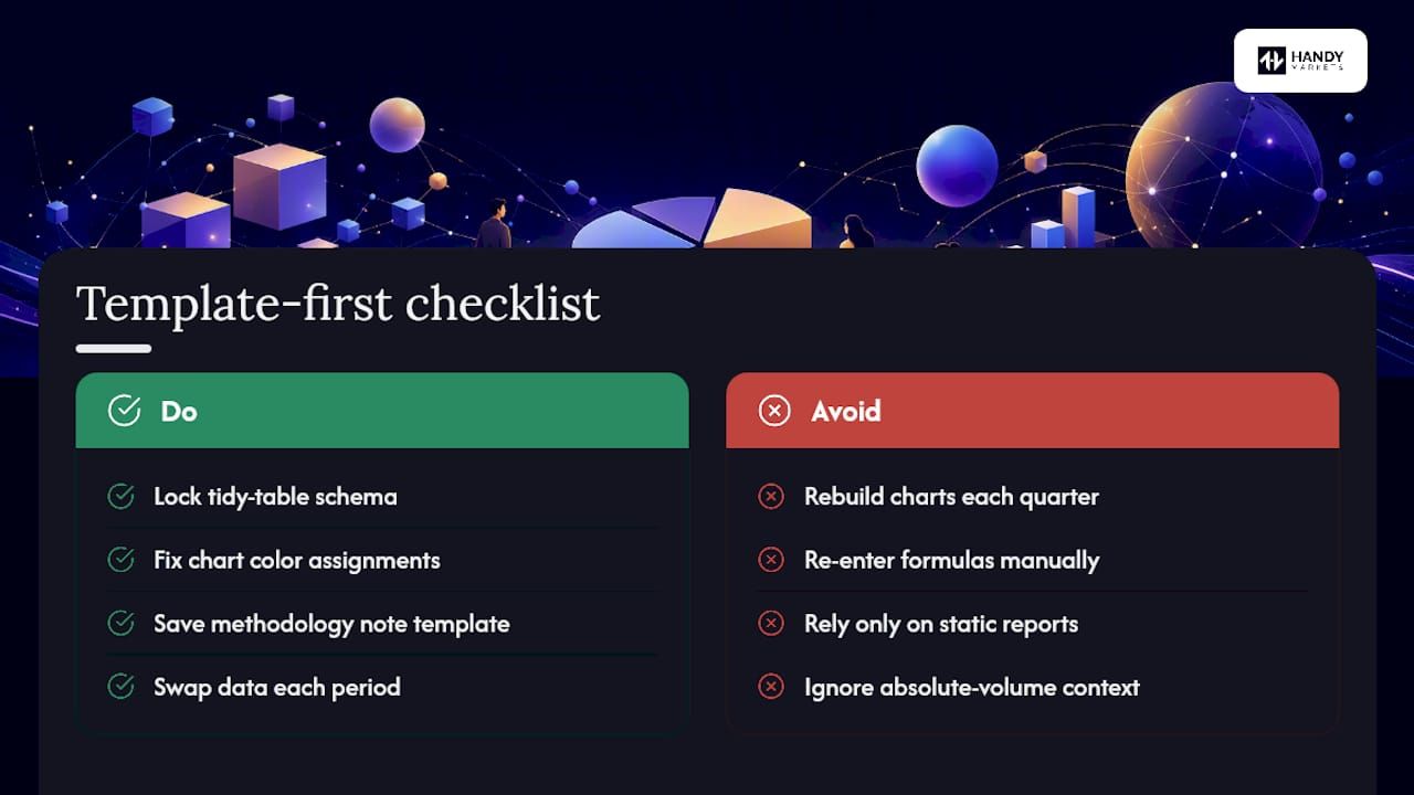
The single biggest time sink in market share analysis is not the math. It is the reformatting: rebuilding color schemes, re-entering formulas, and reconciling data structures every time a new quarter arrives. A template-first approach solves that. Lock in your tidy-table schema, your chart color assignments, and your methodology note structure once, then treat each new period as a data swap rather than a rebuild.
Handy Markets reinforces this by supplying live market signals that slot directly into a pre-built monitoring layer. Static industry reports give you the quarterly snapshot; live feeds give you the signal when something moves between reports. Together, they cover both the structural picture and the real-time pulse that market insights-driven investing depends on.
The Q2 2026 cloud and smartphone examples above also illustrate a subtler point: record-high share in a declining market, as Apple achieved, tells a fundamentally different story than the same share in a growing one. No chart type reveals that automatically. The analyst has to build it in through annotation and an adjacent absolute-volume panel. Templates that include that second panel by default make the right analysis the easy analysis.
Handy Markets brings live data to your market share workflow
Static reports give you the quarterly snapshot. What they cannot do is alert you the moment a price movement or market signal suggests a share shift is underway. Handy Markets closes that gap: real-time data across stocks, crypto, commodities, indices, ETFs, and currencies, all in one customizable markets dashboard, with alerts delivered via Telegram, Discord, Slack, SMS, Webhook, or Email the instant a threshold is crossed.
For analysts building market share charts, Handy Markets fits at both ends of the workflow. Pull live price and market data via API or export to feed your Excel, Power BI, or Python pipeline. Then set alerts so you know when a signal worth updating your charts has arrived, without manually checking sources every day. Visit Handy Markets to set up your first market monitor and connect it to the alert channel your team already uses.
Sources
Primary data portals:
- Market Share: Definition, Calculation & Importance
- CRN
- Omdia: Global smartphone shipments fell 6% in 2Q26 as supply-side pressures reshape the market
- Vendor Market Share Worldwide | Statcounter Global Stats
- Market Share Research Methodology | Gartner