

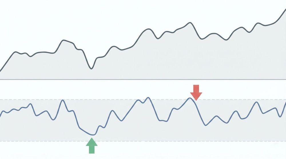
A money flow index chart plots a 0 to 100 oscillator that tells you whether volume-backed buying or selling pressure is building in an asset, so you can flag overbought and oversold extremes before they turn into reversals. It works by weighting price momentum with volume, which gives you an earlier read on conviction than price alone.
- Default setting: 14 periods
- Standard thresholds: above 80 signals overbought, below 20 signals oversold
- Best use: confirming trend strength and spotting divergences, not trading in isolation
Pro Tip: Never act on an overbought or oversold reading by itself. Wait for price to confirm the turn, like a broken trendline or a lower high, before you place the trade.
Key Takeaways
The Money Flow Index turns raw price and volume into a single 0 to 100 reading that confirms trend strength and flags reversals earlier than price-only tools like RSI.
| Point | Details |
|---|---|
| Formula core | MFI weights typical price by volume, then converts the resulting money flow ratio into a 0 to 100 score. |
| Default settings | Use the 14-period lookback unless day trading calls for 9 to 10, or swing trading favors 20 to 21. |
| Read thresholds with context | Treat 80/20 as guidelines; strong trends can keep MFI extreme for weeks without a reversal. |
| Confirm before acting | Pair MFI divergence or extremes with a price structure break or trend filter, never in isolation. |
| Automate the watching | Handy Markets lets you set MFI-based alerts across crypto, stocks, and FX, routed to Telegram, Slack, Email, or Webhook. |
Where to Go Deeper on MFI
- StockCharts ChartSchool: the clearest formula walkthrough and scan examples
- Investopedia: plain-language thresholds and divergence explanations
- Fidelity: practical cautions on trusting extreme readings
- Handy Markets: live charts and alerts for applying these signals in real time
Table of Contents
- What Does the Money Flow Index Chart Actually Measure?
- How Do You Calculate the Money Flow Index?
- What Do Overbought, Oversold, and Divergence Signals Mean?
- How Should You Set Up an MFI Chart?
- What Trading Signals Can You Build Around MFI?
- Where Does the Money Flow Index Chart Go Wrong?
- Money Flow Index vs. RSI vs. Chaikin Money Flow
- How Real-Time Data Turns MFI Into an Actionable Signal
- Turn MFI Setups Into Alerts With Handy Markets
- Frequently Asked Questions
- Sources
What Does the Money Flow Index Chart Actually Measure?
The Money Flow Index measures buying and selling pressure by combining typical price (high plus low plus close, divided by three) with volume over a set lookback period, usually 14 bars. That volume component is what separates it from a pure price oscillator: two assets can post identical price moves, but the one with heavier volume behind the move shows a stronger MFI reading, which tells you more people are backing that price action with real money.
The indicator was developed by Gene Quong and Avrum Soudack, who built it as a volume-weighted cousin to the Relative Strength Index. Like RSI, it runs on a 0 to 100 scale, but MFI’s inclusion of volume is why traders often call it the “volume-weighted RSI.”
- Inputs: typical price and volume, not closing price alone
- Scale: 0 to 100, same range as RSI
- Origin: created by Quong and Soudack as a volume-sensitive momentum tool
How Do You Calculate the Money Flow Index?
Here’s the full sequence, and it’s simpler than it looks once you work through one example.
- Typical price = (High + Low + Close) ÷ 3 for each period.
- Raw money flow = Typical price × Volume for that period.
- Label each period’s raw money flow as positive (if typical price rose from the prior period) or negative (if it fell).
- Money flow ratio = 14-period positive money flow sum ÷ 14-period negative money flow sum.
- MFI = 100 minus [100 ÷ (1 + Money Flow Ratio)].
Say a stock’s typical price rises more often than it falls over the last 14 days, creating a money flow ratio that, when plugged into the MFI formula, results in values approaching the standard overbought threshold.
Two edge cases trip up beginners. If negative money flow is zero, the ratio becomes infinite and MFI reads 100. If typical price is unchanged from the prior bar, that period’s raw money flow typically gets excluded from both sums rather than forced into either bucket. This full calculation sequence is laid out in detail on StockCharts ChartSchool, which also confirms 14 periods as the default lookback.
A shorter lookback, like 9 periods, reacts faster but throws more false signals. A longer one, like 21 periods, smooths the noise but lags real reversals. Also note that platforms can differ slightly on intraday volume, since incomplete session data will shift your raw money flow sums until the bar closes.
What Do Overbought, Oversold, and Divergence Signals Mean?
The classic MFI thresholds are above 80 for overbought and below 20 for oversold, a standard confirmed across Investopedia’s breakdown of the indicator. Some traders tighten those bands to 90/10 for higher conviction on fewer signals, or widen them to 70/30 to catch reversals earlier on choppier, less liquid assets.

Divergence is where MFI earns its keep. A bearish divergence forms when price prints a higher high but MFI prints a lower high, hinting that the rally lacks the volume support to continue. A bullish divergence is the mirror image: price makes a lower low while MFI makes a higher low, suggesting selling pressure is drying up even as price keeps sliding.
A failure swing adds confirmation: MFI crosses back below 80 after failing to make a new high, or back above 20 after failing to make a new low, and price then breaks a nearby support or resistance level to validate the signal.
In strong trends, MFI can hover above 80 or below 20 for extended stretches, and Fidelity notes these extremes should never be treated as a standalone exit signal without price confirmation, a point covered in Fidelity’s MFI guide.
In an established uptrend, watch for pullbacks toward the 40 level as potential entry zones rather than waiting for oversold readings that may never arrive. In a downtrend, rallies that stall near 60 often mark good areas to look for shorts.
Pro Tip: Mark the 40 and 60 levels on your chart during trending markets. They act like a trend’s “reset zone,” where pullbacks often find support without ever touching true oversold territory.
How Should You Set Up an MFI Chart?
Stick with the 14-period default unless you have a specific reason to change it. It balances responsiveness and noise well enough that it’s become the industry standard, per StockCharts. Drop to 9 or 10 periods if you’re day trading and need faster signals; stretch to 20 or 21 if you’re swing trading and want fewer whipsaws.
- Place MFI directly below the price panel so you can eyeball divergences without scrolling
- Match your MFI period to your chart timeframe (14 daily bars for swing trades, 14 hourly bars for intraday setups)
- Be cautious with volume sampling on illiquid intraday charts, since thin trading can distort the raw money flow inputs
- Avoid layering moving averages onto MFI itself unless you’re specifically smoothing a noisy short-period setting
Pro Tip: If your MFI chart looks jumpy and unreliable on 5-minute candles, it’s usually a volume problem, not an indicator problem. Switch to a 15-minute or hourly chart and the signal often cleans up immediately.
What Trading Signals Can You Build Around MFI?
Four rule sets cover most practical use cases:
- Mean reversion: buy when MFI drops below 20 and starts curling up, sell or short when it climbs above 80 and rolls over.
- Divergence entries: enter on a confirmed bullish or bearish divergence once price breaks the corresponding trendline.
- Trend-following entries: in an uptrend, buy pullbacks to the 40 zone; in a downtrend, look to short rallies to 60.
- Confirmation only: use MFI to validate a breakout, requiring both a volume surge and an MFI push above 50.
For scanning, filter for a minimum average daily volume so you’re not chasing signals on thinly traded names, and pair the MFI trigger with a basic price filter, like stocks trading above their 50-day moving average.
Always place a stop-loss below recent structure. Never trade an MFI signal in isolation.
Pro Tip: Combine MFI with a simple trend filter, like a 50-day moving average. It cuts down on false reversal signals in a strong trending market dramatically.
Where Does the Money Flow Index Chart Go Wrong?
MFI’s biggest blind spot is persistence: in a powerful macro trend, it can sit above 80 or below 20 for weeks, and traders who short every overbought reading get run over repeatedly. Low-volume assets produce jumpy, unreliable MFI lines, since a single unusual print can skew the raw money flow sums. Data can also vary slightly between vendors depending on how they handle intraday volume.
- Require price structure to confirm any MFI extreme before acting
- Check the volume profile, not just the MFI line, on thinly traded names
- Look for agreement across two timeframes before trusting a divergence signal
Pro Tip: Don’t shrink your position size just because MFI looks stretched during a strong macro move. That instinct feels disciplined, but it often means exiting winners far too early.
Money Flow Index vs. RSI vs. Chaikin Money Flow
RSI is a pure price-momentum oscillator with no volume component at all. MFI takes that same momentum logic and weights it by volume, which is why it sometimes turns ahead of RSI when volume shifts before price does, an edge Investopedia attributes to volume’s tendency to lead price at transition points. Chaikin Money Flow works differently again, using exponential moving averages of accumulation and distribution to track buying and selling pressure over time, a distinction explained in Investopedia’s money flow overview.
- Use RSI when you want pure price momentum with no volume noise
- Use MFI when volume confirmation matters for your entries
- Use Chaikin Money Flow when you’re tracking longer accumulation and distribution trends
How Real-Time Data Turns MFI Into an Actionable Signal
Stale or incomplete intraday volume is the single biggest cause of false MFI readings, since a scan built on a half-formed candle will flag setups that vanish once the bar closes. A clean workflow looks like this: scan for MFI crossing below 20 or above 80, set a threshold alert on that condition, then route the notification wherever you actually watch for trade triggers.
- Live volume aggregation reduces the lag between a real shift in money flow and your scan catching it
- Multi-channel alerts mean you don’t have to babysit a chart all day to catch a threshold cross
Real-time price and volume data across crypto, stocks, and FX, paired with alerts sent to Telegram, Slack, Email, or Webhook, turns an MFI scan from a manual chore into a background process, according to Handy.
A Trader’s Note on Using MFI Day to Day
MFI earns its spot on a chart mainly for trend confirmation and divergence watching, not as a standalone trigger. Pair it with a trend filter and consistent position sizing, and it becomes a genuinely useful second opinion rather than a source of noise.
Turn MFI Setups Into Alerts With Handy Markets
Handy Markets gives you the piece a chart alone can’t: a way to know the instant your MFI conditions actually trigger, without staring at candles all day. The platform covers live charts and pricing across crypto, stocks, forex, indices, and commodities, so the same oversold or divergence setup you built for one asset class works across all of them.
Setting it up takes two steps. First, define your condition, like MFI dropping below 20 on a daily chart. Second, create an instant alert tied to that threshold and route it to whichever channel you actually check, whether that’s Telegram, Slack, Email, SMS, or a webhook feeding your own system. If you’re watching a specific token, the FLOW asset page shows how a single-asset chart pairs with instant notifications. Set up your first MFI alert on Handy Markets’ cryptocurrency pages and stop refreshing charts to catch a signal you could have delivered straight to your phone.
FAQ
What is a good MFI reading for a buy signal?
A reading below 20 that curls upward, ideally alongside a bullish divergence or a break of a short-term downtrend line, offers a stronger buy signal than the raw number alone.
Is a 14-period money flow index chart good for day trading?
It works, but many day traders shorten the period to 9 or 10 for faster signals on intraday charts, accepting more noise in exchange for quicker reads.
Can MFI replace RSI entirely?
Not really. MFI adds volume weighting, which helps in liquid, high-volume assets, but RSI still works fine as a simpler momentum check on thinly traded names where volume data gets noisy.
Why does my MFI chart look different from my broker’s?
Vendors handle intraday volume aggregation differently, so slight discrepancies between platforms are normal, especially before a session closes.
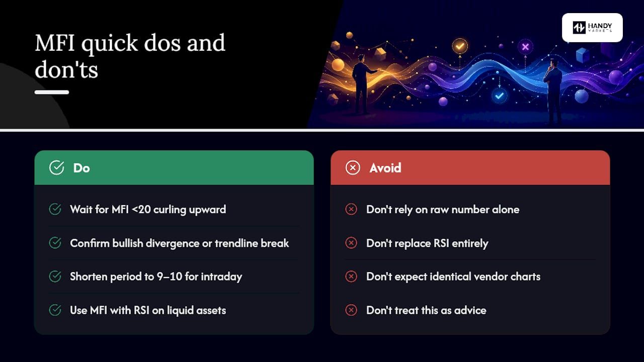
This article is general information, not a substitute for advice from a qualified financial advisor. Consult a qualified financial professional about your own circumstances before acting on anything here.
Sources
- Money Flow Index (MFI) - ChartSchool - StockCharts.com
- Money Flow Index (MFI) — Investopedia
- What Is The Money Flow Index? - Fidelity