TL;DR:
- Reading live charts helps traders interpret dynamic price and volume data to make better decisions.
- Japanese candlestick charts are best for beginners due to their clear visual signals, especially on daily timeframes.
Reading live charts is defined as the practice of interpreting dynamic, real-time visual displays of price and volume data to make informed trading and investing decisions. This guide to reading live charts covers everything you need to build that skill from the ground up. Live charts are the heartbeat of financial markets, pulsing with signals that reveal where buyers and sellers are battling for control. Whether you trade stocks, forex, crypto, or commodities, the ability to read these charts separates reactive guessing from deliberate analysis. We will walk through chart types, timeframes, price action, volume, and support and resistance zones, giving you a practical framework you can apply today.
What are the main types of live financial charts?
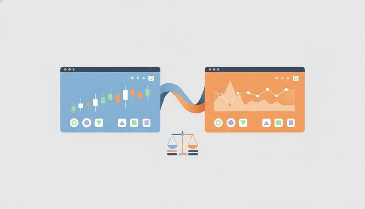
Three chart types dominate financial markets: line charts, bar charts, and Japanese candlestick charts. Each displays price data differently, and choosing the right one shapes how clearly you read market sentiment.

Line charts are the simplest format. They connect closing prices over time with a single line, which makes them easy to read at a glance. The limitation is significant: they show only one data point per period, hiding the full story of what happened between open and close.
Bar charts solve that problem by displaying four data points per period: the open, high, low, and close (commonly called HLOC). Each bar is a vertical line with two horizontal ticks. The left tick marks the open price and the right tick marks the close. Bar charts give you more context than line charts, but they can feel visually cluttered for beginners.
Japanese candlestick charts are the industry standard for beginners as of 2026. Like bar charts, they show open, high, low, and close. The difference is visual clarity. A candle has a wide body that fills the space between open and close, plus thin wicks above and below showing the high and low. A green (or white) body means the price closed higher than it opened. A red (or black) body means it closed lower. Candlestick color, body size, and shadow length communicate bullish or bearish conditions at a glance, which is why most professional traders rely on them.
| Chart type | Data points shown | Best for | Visual clarity |
|---|---|---|---|
| Line | Close only | Long-term trend overview | High |
| Bar (HLOC) | Open, high, low, close | Intermediate traders | Medium |
| Japanese candlestick | Open, high, low, close | All levels, especially beginners | Very high |
Start with candlesticks. They give you the most information in the most readable format.
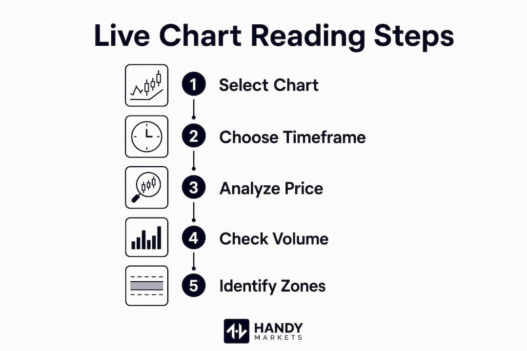
How to choose the right timeframe for reading live charts
Timeframe selection is one of the most overlooked decisions in live chart analysis. Every chart displays the same price data, but the timeframe you choose determines how much noise you see and how clearly trends emerge.
Common timeframes run from 1 minute all the way to monthly. Day traders typically work with 1-minute to 15-minute charts for entries and exits. Swing traders favor daily to weekly charts to capture multi-day moves. Long-term investors rely on weekly and monthly charts to track macro trends without reacting to short-term volatility.
Beginners should start with the Daily (D1) timeframe to reduce market noise and get clearer signals. The daily chart smooths out the minute-to-minute chaos that overwhelms new traders. Each candle represents a full trading day, so patterns are easier to spot and less prone to false signals.
The most effective approach is to use two timeframes together. Weekly charts reveal long-term trends while daily charts pinpoint specific entry and exit points. This dual-timeframe method helps you tell the difference between a normal price pullback and a genuine trend reversal.
Pro Tip: Zoom out to the weekly chart before placing any trade on the daily chart. Major support and resistance levels that are invisible on shorter timeframes become obvious when you step back to the bigger picture.
| Timeframe | Typical user | Primary purpose |
|---|---|---|
| 1 min – 15 min | Day traders | Fast entries and exits |
| 1 hour – 4 hour | Active swing traders | Intraday trend confirmation |
| Daily (D1) | Beginners, swing traders | Clear trend and signal reading |
| Weekly | Swing traders, investors | Long-term trend identification |
| Monthly | Long-term investors | Macro market context |
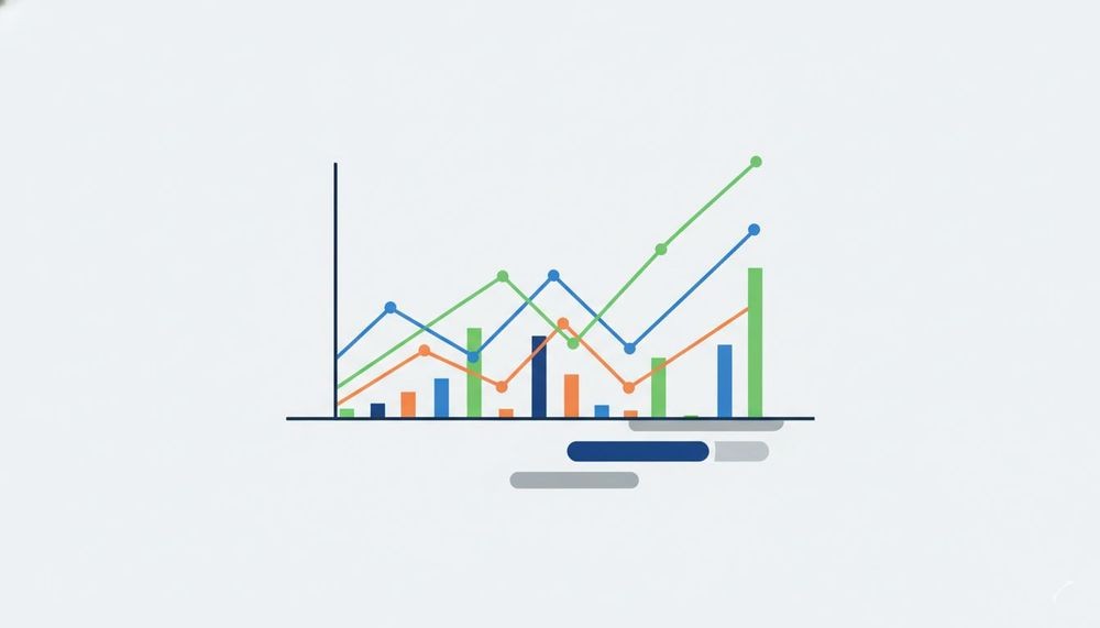
How to interpret price action and volume on live charts
Price action is the most fundamental signal on any chart. Price charts disclose market sentiment and potential direction more directly than any indicator. Every candle you see is the result of thousands of buy and sell decisions made by real market participants. Reading price action means reading the collective conviction of the market.
Indicators like RSI (Relative Strength Index) and Moving Averages are useful, but they are secondary tools. They are calculated from price data, which means they always lag behind what price is already telling you. Learn to read price first, then use indicators to confirm what you already see.
Volume is price action’s most important companion. High volume combined with rising prices signals strong market conviction. It tells you that many participants are actively buying, not just a small group pushing the price up. Conversely, rising volume supports trend continuation while falling volume suggests weakening support. A price move on thin volume is a warning sign, not a confirmation.
Volume bars appear at the bottom of most live charts. Many platforms also display a 50-day average volume line across those bars, which gives you a quick benchmark for whether current activity is above or below normal. For deeper context on interpreting these signals, the price changes trader’s guide from Handy Markets is worth reading alongside this framework.
Key volume and price signals to watch:
- High volume + rising price: Strong buying conviction. Trend likely continues upward.
- High volume + falling price: Strong selling conviction. Trend likely continues downward.
- Low volume + rising price: Weak rally. Buyers lack commitment. Potential reversal ahead.
- Low volume + falling price: Weak selloff. Sellers are not aggressive. Possible support forming.
- Volume spike + price reversal: Climactic move. Often marks a short-term top or bottom.
Pivot points are another price action tool worth learning early. A pivot bar is one that has a lower high and lower low than the bar before it and after it (for a swing low) or a higher high and higher low (for a swing high). These pivots define market structure and show you where the trend is genuinely turning versus just pausing.
Pro Tip: Before adding any indicator to your chart, spend two weeks reading price and volume alone. You will develop pattern recognition that no indicator can replicate.
What are support and resistance zones on live charts?
Support and resistance are the two most practical concepts in live chart reading. Support and resistance are not fixed prices but zones where buying or selling pressure historically clusters. Treating them as exact price points is a common beginner mistake. They are areas, not lines.
Support is a price zone where buyers have repeatedly stepped in and pushed price back up. Resistance is a zone where sellers have repeatedly pushed price back down. These zones form because traders remember where price reversed in the past and act on those memories collectively.
Spotting these zones on a live chart is straightforward. Look for price levels where the chart shows multiple touches, bounces, or consolidation periods. The more times a zone has been tested without breaking, the more significant it becomes. When price finally breaks through a strong resistance zone, that zone often flips and becomes support.
Here is how support and resistance zones improve your trading decisions:
- Entry timing: Buy near support, sell near resistance, rather than chasing price in the middle of a range.
- Stop loss placement: Set stops just below support (for long trades) or just above resistance (for short trades) to limit risk.
- Target setting: Use the next resistance level as a realistic profit target for long positions.
- Trend confirmation: A price that breaks resistance and holds above it confirms an uptrend. A price that breaks support and holds below confirms a downtrend.
- Timeframe layering: Zooming out to higher timeframes reveals key support and resistance levels that are invisible on shorter charts.
For traders tracking multiple assets, monitoring live stocks in real time alongside these zones makes it far easier to act when price reaches a critical level.
Key Takeaways
Reading live charts effectively requires combining the right chart type, timeframe, price action analysis, and volume confirmation to make confident, well-grounded trading decisions.
| Point | Details |
|---|---|
| Use candlestick charts | Japanese candlesticks show open, high, low, and close with the clearest visual signals for beginners. |
| Start with the daily timeframe | The D1 chart reduces noise and gives cleaner signals before you move to shorter timeframes. |
| Price action leads, indicators follow | Read raw price movement first; use RSI and Moving Averages only to confirm what price already shows. |
| Volume validates every move | High volume confirms trend strength; low volume on a price move signals a weak, unreliable signal. |
| Support and resistance are zones | Treat these as price areas, not exact numbers, and use them to time entries, exits, and stop losses. |
What we have learned from years of watching live charts
The single biggest mistake beginners make is adding too many indicators to a chart before they understand what price is doing. Overloading charts with indicators leads to analysis paralysis. A chart covered in RSI, MACD, Bollinger Bands, and three moving averages does not give you more information. It gives you more noise dressed up as information.
We have found that the traders who improve fastest are the ones who commit to reading a clean chart, just price and volume, for at least a few weeks before touching any indicator. That practice builds genuine visual pattern recognition. You start to feel when a move has conviction and when it does not. No indicator teaches you that faster than raw observation.
The dual timeframe approach is the one habit we would insist every trader build early. Check the weekly chart to understand the trend. Then drop to the daily chart to find your entry. That context prevents you from buying into a downtrend just because the daily chart looks temporarily bullish.
Patience is the underrated skill in chart reading. Markets repeat patterns, but not on your schedule. The traders who wait for price to reach a well-defined support or resistance zone before acting consistently outperform those who chase moves in the middle of a range. Build the habit of waiting for the chart to come to you.
Real-time tools that support your chart reading practice
Reading live charts is only as good as the data feeding them. Handy Markets gives you live prices across markets including stocks, crypto, forex, commodities, indices, and ETFs, all in one place. You can personalize your market view and track the assets most relevant to your strategy without switching between platforms.
One feature that directly supports chart reading is the price alert system. When price approaches a key support or resistance zone you have identified, Handy Markets can notify you instantly via Telegram, Discord, Slack, SMS, Webhook, or Email. Set up price alerts for free and stop watching screens all day waiting for a level to be reached. Let the market come to you while you stay focused on analysis.
FAQ
What is the best chart type for beginners?
Japanese candlestick charts are the best starting point for beginners. They display open, high, low, and close data with clear visual cues that make market sentiment easy to read quickly.
What timeframe should a new trader use first?
The Daily (D1) timeframe is the recommended starting point. It filters out short-term noise and produces cleaner signals than intraday charts, making patterns easier to identify.
How does volume help in reading live charts?
Volume confirms whether a price move has real conviction behind it. High volume on a rising price confirms strong buying interest; low volume on the same move suggests the rally may not hold.
What are support and resistance zones?
Support and resistance are price areas where buying or selling pressure has historically concentrated. They are not exact price points but zones that traders use to time entries, set stop losses, and identify profit targets.
Do I need indicators to read live charts effectively?
No. Price action and volume provide the most direct market signals. Indicators like RSI and Moving Averages are useful secondary tools, but they should be added only after you are comfortable reading raw price and volume data.