TL;DR:
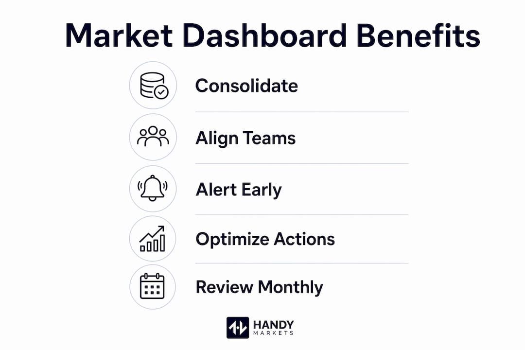
- Market dashboards consolidate real-time financial data into a single view, speeding up decision-making. They eliminate data silos, reduce errors, and provide alerts for timely market responses. Regularly pruning metrics and linking them to specific actions ensures effective trading routines.
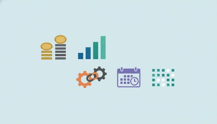
A market dashboard is a digital tool that aggregates and visualizes real-time financial data across multiple asset classes, giving traders and investors a single, unified view of market conditions. The question of why use market dashboards has a direct answer: they compress hours of data gathering into seconds of clear insight. Without one, you are reading from scattered sources, reconciling conflicting numbers, and making decisions on information that is already stale. Platforms like Handy Markets demonstrate how consolidating live prices, percentage changes, and alerts for stocks, crypto, commodities, and forex into one place changes the quality and speed of every decision you make.
Why use market dashboards for faster, clearer decisions
Market dashboards reduce the time required to assess complex financial data by consolidating multiple sources into one view. That time savings is not a convenience. In fast-moving markets, a delay of even a few minutes between a price signal and your response can mean the difference between a profitable entry and a missed opportunity.

The core function of a market dashboard is aggregation. Instead of toggling between a stock screener, a crypto exchange, a commodities feed, and a forex rate table, you see everything in one place. The data visualization layer then translates raw numbers into charts, color-coded percentage changes, and trend indicators that your brain processes far faster than a spreadsheet column.
| Data source | Without a dashboard | With a dashboard |
|---|---|---|
| Stock prices | Multiple tabs, manual refresh | Live feed, single screen |
| Crypto movements | Exchange-specific views | Unified percentage changes |
| Commodity rates | Separate news or broker tools | Real-time chart overlay |
| Forex rates | Currency converter lookups | Live rate table with alerts |
| Portfolio overview | Manual calculation | Automatic aggregation |
The table above shows a pattern that repeats across every asset class: fragmentation costs time, and time costs money. A well-built dashboard collapses that fragmentation into one coherent picture.
- Real-time monitoring: Live price feeds update continuously, so your view reflects the market as it exists right now, not five minutes ago.
- Visual pattern recognition: Charts and color coding let you spot trends, reversals, and anomalies faster than reading raw data.
- Cross-asset correlation: Seeing crypto, equities, and commodities side by side reveals relationships that isolated views hide.
- Alert integration: Price alerts on Telegram, Discord, Slack, SMS, or email notify you the moment a threshold is crossed, without requiring you to watch a screen all day.
Pro Tip: Set your dashboard’s default view to the asset classes you trade most often. Reducing visual noise on your primary screen cuts the cognitive load that leads to slow or emotional decisions.
How centralized dashboards improve team alignment and reduce errors
Centralized dashboards improve organizational alignment by providing a consistent, real-time narrative that eliminates fragmented data reconciliation. That finding matters whether you are a solo trader or part of an investment team. When everyone reads from the same live data source, interpretation errors shrink and meetings about “which number is correct” disappear.
Data silos are one of the most underestimated risks in financial analysis. One analyst pulls yesterday’s closing prices from a broker platform. Another uses a delayed feed from a news aggregator. A third is working from a spreadsheet updated weekly. All three are making decisions, but none of them are looking at the same market. A single source of truth built into a shared dashboard removes that risk entirely.
The benefits of centralized market dashboards extend beyond accuracy. Shared dashboards also create accountability. When a decision is made based on a specific data point visible to the whole team, the reasoning is transparent and traceable. That traceability matters when you need to review what went wrong or replicate what went right.
- Eliminated data silos: All team members access the same live feed, removing version conflicts.
- Fewer status meetings: Real-time visibility means less time spent updating each other on market conditions.
- Consistent metrics: Every stakeholder sees the same percentage changes, volume figures, and price levels simultaneously.
- Faster consensus: Shared context accelerates agreement on entries, exits, and position sizing.
Pro Tip: Align your dashboard metrics directly with your trading or investment goals. If your strategy focuses on momentum, your primary view should show volume, rate of change, and relative strength, not just price. Metrics that do not connect to a decision should be removed.
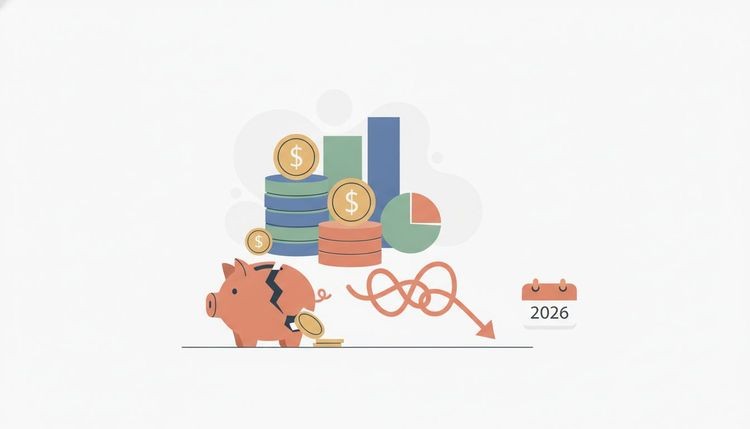
How dashboards prevent costly mistakes from delayed market visibility
Market watch dashboards mitigate delayed visibility risks by enabling early identification of market shifts before they become expensive errors. Delayed data is not just inconvenient. It is a direct financial risk. A trader relying on a feed that lags by even a few minutes during a volatile session can misprice an entry, hold a losing position too long, or miss a reversal entirely.
The importance of data visualization becomes clearest in fast markets. When prices move sharply, a visual alert or a color-coded threshold breach is processed faster than a number buried in a table. Dashboards that include early warning signals, such as volatility spikes, volume surges, or price crossing a key level, give you time to act rather than react.
Consider what lagged data costs in practice. A commodities trader using a 15-minute delayed feed misses an oil price spike triggered by a supply disruption. A crypto investor without real-time alerts holds through a flash crash that a live dashboard would have flagged within seconds. These are not edge cases. They are the normal cost of operating without real-time market monitoring.
Common errors a market dashboard helps you avoid:
- Mispricing entries or exits due to stale bid/ask data
- Holding losing positions because a reversal signal was missed
- Missing correlated moves across asset classes that signal broader market shifts
- Reacting emotionally to news headlines instead of verified price action
- Overlooking volatility spikes that signal elevated risk before a position is opened
Market dashboard best practices that actually change your behavior
Dashboards must lead to specific, pre-planned actions. A dashboard that you look at without a defined response protocol is decoration. The goal is not to have more data visible. The goal is to have the right data trigger the right behavior at the right moment.
Here are the practices that separate effective dashboard users from those who simply collect screens.
- Define your action triggers before you open the market. Decide in advance what price level, volume threshold, or volatility reading will prompt a buy, sell, or hold. Write it down. Your dashboard should display exactly those metrics front and center.
- Organize by sector or correlated group, not by asset type alone. Viewing positions as isolated signals leads to misunderstanding portfolio risk. Grouping tech equities, growth crypto, and high-beta commodities together reveals macro bets you may not have realized you were making.
- Keep a decision journal linked to your dashboard views. When you act on a signal, note the metric that triggered it and the outcome. Over time, this review trail shows which dashboard indicators actually predict your results and which ones just add noise.
- Prune metrics that have never triggered an action. More data does not improve decisions. The competitive advantage comes from organizing data well and separating internal execution issues from external market shifts. If a metric has sat on your dashboard for 30 days without influencing a single decision, remove it.
- Set tiered alerts, not just price alerts. A first-level alert at 2% movement gives you awareness. A second-level alert at 5% triggers a pre-planned response. Structuring alerts this way means your financial market alerts scale with market intensity rather than flooding you with noise during normal sessions.
Pro Tip: Review your dashboard layout monthly, not just your positions. Remove any metric that has not contributed to a decision in the past four weeks. A cleaner dashboard is a faster dashboard.
Key Takeaways
Market dashboards are most valuable when they are built around pre-planned actions, organized by correlated asset groups, and pruned regularly to remove metrics that never drive decisions.
| Point | Details |
|---|---|
| Consolidation saves time | Aggregating stocks, crypto, forex, and commodities in one view cuts data-gathering time significantly. |
| Centralization reduces errors | A shared, real-time dashboard eliminates data silos and version conflicts across teams. |
| Real-time alerts prevent losses | Live price alerts on Telegram, Slack, or SMS flag market shifts before they become costly mistakes. |
| Action triggers define value | A dashboard only works if each metric connects to a specific, pre-planned trading or investment response. |
| Sector grouping reveals risk | Organizing positions by correlated groups uncovers macro bets that isolated asset views hide. |
The honest truth about dashboards in 2026
We have watched traders build elaborate, multi-screen setups and still make reactive, emotional decisions. The dashboard was not the problem. The missing piece was discipline. A dashboard does not remove uncertainty from markets. Trading dashboards help manage uncertainty systematically, promoting intentional routines rather than eliminating unpredictability. That distinction matters more than any feature list.
The traders and investors we see succeed with dashboards share one habit: they treat the dashboard as a decision protocol, not a data display. Every metric on the screen has a job. Every alert has a pre-written response. When the signal fires, the decision is already made. The dashboard just delivers the trigger.
The risk we see most often is dashboard sprawl. Professionals add metrics because they feel informative, not because they connect to an action. Over time, the screen fills up, cognitive load rises, and the tool that was supposed to speed up decisions actually slows them down. Strategic pruning is not optional. It is the discipline that keeps a dashboard useful as markets grow more complex.
The platforms that serve traders best in 2026 are those that combine live data freshness with flexible alert routing. Data that is 15 minutes old in a volatile session is not market data. It is market history. Build your dashboard around the present, not the recent past.
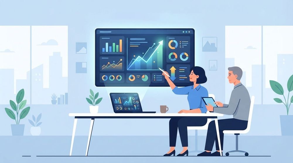
Real-time market data with Handy Markets
Handy Markets gives you live prices, charts, and price change alerts across cryptocurrencies, stocks, commodities, ETFs, and forex, all in one place. Setting up your personalized market view takes minutes, not hours.
Price alerts route directly to Telegram, Discord, Slack, SMS, Webhook, or Email, so you never miss a threshold breach while away from your screen. Whether you track live crypto prices or monitor commodities markets for supply-driven moves, Handy Markets delivers the real-time data layer your dashboard strategy depends on. No trading execution, no complexity. Just clean, live market data and alerts built for traders who act on signals, not guesses.
FAQ
What is a market dashboard?
A market dashboard is a digital tool that aggregates real-time financial data from multiple asset classes into a single visual interface. It displays live prices, percentage changes, charts, and alerts to support faster, more informed trading and investment decisions.
Why use market dashboards instead of individual data sources?
Individual data sources create fragmentation and version conflicts that slow decisions and introduce errors. A centralized dashboard provides one consistent, real-time view that eliminates reconciliation and reduces the risk of acting on stale data.
How do market dashboards improve decision-making?
Dashboards improve decisions by connecting each visible metric to a pre-planned action trigger. When a price level or volatility threshold is breached, the response is already defined, removing emotional or reactive choices from the process.
What are the biggest mistakes traders make with dashboards?
The most common mistake is adding too many metrics without linking each one to a specific action. Dashboard sprawl raises cognitive load and slows response times. Pruning unused metrics monthly keeps the tool effective.
How often should I update my market dashboard setup?
Review your dashboard layout monthly. Remove any metric that has not influenced a decision in the past four weeks, and adjust alert thresholds to reflect current market volatility rather than conditions from weeks ago.