

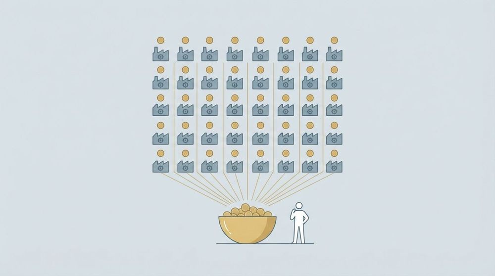
The Dow Jones Industrial Average’s dividend yield sits near the upper single-digit range as of mid-2026, based on aggregate trailing-12-month payouts across all 30 components divided by the current index level. That figure is published daily by S&P Dow Jones Indices, and it’s the starting point every income-focused investor should know. One critical caveat: the DJIA is a price-only index, meaning reinvested dividends are not reflected in the headline number. To capture total dividend income, you need to track either the S&P Dow Jones Indices total-return series or a dividend-distributing ETF like the SPDR Dow Jones Industrial Average ETF (DIA), available through State Street Global Advisors.
The yield you see quoted on any given day reflects the market’s collective dividend output relative to where prices are trading. When prices fall sharply, the yield rises, even if no company has raised its payout. That mechanical relationship is what makes the Dow’s yield both a useful signal and a number worth reading carefully.
Table of Contents
- How is the Dow Jones dividend yield calculated?
- Where can you find live and historical Dow dividend yield data?
- Which Dow components pay the highest dividend yields?
- How has the Dow’s dividend yield changed over time?
- How should investors actually use the Dow dividend yield?
- How do you set up monitoring for the Dow yield and its top payers?
- Real-time Dow yield tracking with Handy Markets
- Sources
How is the Dow Jones dividend yield calculated?
Investopedia’s breakdown of the DJIA yield lays out the formula cleanly:
(Aggregate annual dividends ÷ Dow Divisor) ÷ DJIA level = DJIA dividend yield
Each component matters:
- Aggregate annual dividends: the sum of each constituent’s trailing-12-month dividend per share, multiplied by its share count contribution to the index.
- Dow Divisor: a proprietary constant maintained by S&P Dow Jones Indices that adjusts for stock splits, component changes, and other corporate actions. It keeps the index comparable over time.
- DJIA level: the current price-weighted index value.
Price-weighting is the feature that separates the Dow from market-cap-weighted indices like the S&P 500. A stock trading at $400 per share carries roughly four times the index influence of a stock at $100, regardless of each company’s total market value. That means a high-priced, low-yielding stock like UnitedHealth Group can move the index level far more than a lower-priced, higher-yielding stock like Verizon. The practical consequence: the index-level yield is not a simple average of constituent yields. It’s tilted by price.
Yield also shifts when dividends are cut, when a component is swapped out, or when prices move sharply in either direction. The DIA ETF yield can differ from the DJIA price-index yield because the ETF reports an SEC yield based on its actual distribution schedule, which may lag or lead the index’s aggregate calculation by days or weeks. Understanding why tracking stock indices matters helps put these nuances in context.
Where can you find live and historical Dow dividend yield data?
Not all sources are equal, and using the wrong one for the wrong purpose leads to mismatched figures. Here’s how the main sources stack up:
- S&P Dow Jones Indices (spglobal.com/spdji): The authoritative source for official methodology, the Dow Divisor, and the total-return series. Use this when you need to reconcile discrepancies or cite the official yield for institutional purposes.
- SPDR / DIA ETF pages (ssga.com): Best for the ETF’s current SEC yield, monthly distribution history, and 30-day yield. The DIA is the most direct investable proxy for the Dow’s dividend stream.
- Macrotrends (macrotrends.net): Excellent for long-run historical charts going back decades, with downloadable data. Use it to visualize yield over full market cycles.
- Slickcharts (slickcharts.com): Provides a sortable, per-constituent yield table updated regularly. Useful for quickly identifying which Dow stocks are paying the most at any given moment.
- Investopedia: Best for conceptual grounding on how the yield is calculated and what the Dow Divisor does. Not a live data source.
- Major broker platforms (Fidelity, Schwab, Bloomberg Terminal): Useful for real-time constituent-level data, ex-date calendars, and payout-ratio screens.
For a headline yield figure to quote or monitor, the DIA ETF page and S&P Dow Jones Indices are the most reliable. For historical context, Macrotrends and Slickcharts fill the gap. When figures diverge between sources, the difference usually traces back to whether the source is using TTM dividends, forward (run-rate) dividends, or the ETF’s SEC yield, which are three distinct metrics.
| Data need | Best source | Yield type reported |
|---|---|---|
| Official index yield / methodology | S&P Dow Jones Indices | Price-index aggregate |
| ETF distributions and SEC yield | SPDR / DIA (ssga.com) | ETF SEC yield / distribution |
| Historical 10 year chart | Macrotrends | TTM, price-index |
| Per-constituent yield sort | Slickcharts / indexArb | TTM per stock |
| Conceptual explanation | Investopedia | Illustrative |
Which Dow components pay the highest dividend yields?
Yield concentration in the Dow tends to cluster in telecom, energy, and healthcare. As of mid-2026, the highest-yielding constituents typically include Verizon (VZ), Chevron (CVX), IBM, Johnson & Johnson (JNJ), and Coca-Cola (KO), with yields that often run materially above the index average. Dripinvesting and indexArb’s sorted yield table show typical outlier yields near 3%–6% for the top payers, while growth-oriented names like Apple (AAPL) and Microsoft (MSFT) tend to yield under 1%.

Source: S&P Dow Jones Indices, Slickcharts, indexArb. Yields are approximate trailing figures as of mid-2026 and change daily with price movements.
A few things stand out. Verizon’s yield looks attractive in isolation, but its elevated yield partly reflects years of share-price pressure, not accelerating dividend growth. That’s a textbook yield trap. Apple and Microsoft, despite tiny yields, carry the heaviest price-weighting in the index, so their price moves dominate the index level and therefore suppress the overall yield when they rally.
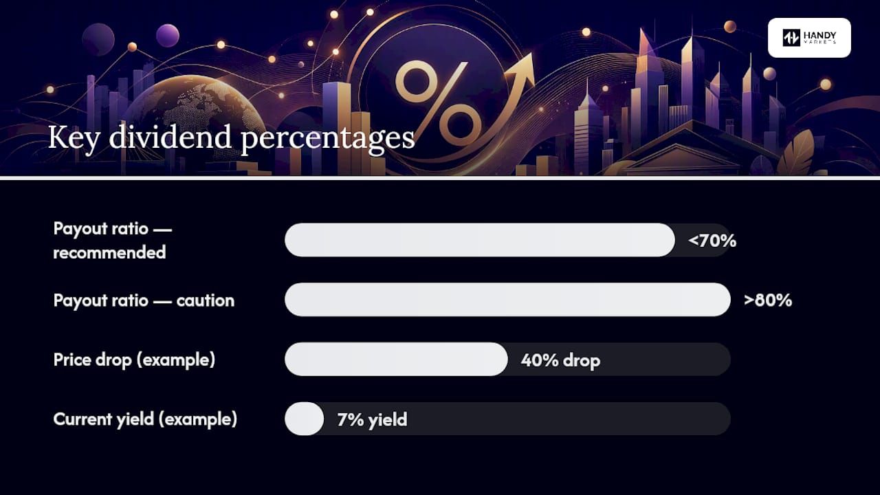
Before acting on any of these figures, run a payout-ratio check. A company paying out more than 80%–90% of earnings in dividends has limited room to grow that payout and is more vulnerable to a cut during a downturn.
How has the Dow’s dividend yield changed over time?
The Dow’s yield has moved in a wide band across market cycles. Investopedia’s historical analysis notes that between 2010 and 2021, the yield generally traded in a roughly 1.5%–3%+ range, with spikes during market dislocations when prices fell faster than companies could cut dividends.
The main drivers of those moves:
- Price dislocations: A sharp market selloff raises the yield mechanically, even with no dividend changes. The March 2020 COVID crash briefly pushed yields higher across most indices before companies began cutting or suspending payouts.
- Dividend policy shifts: Companies increasing buybacks instead of dividends reduce the aggregate payout pool, which gradually compresses the index yield over time.
- Sector composition changes: When the Dow adds a high-growth, low-yield tech name and removes a high-yield industrial or telecom name, the index yield drops structurally.
- Energy-price cycles: Chevron’s yield fluctuates significantly with oil prices. An energy rally compresses CVX’s yield; a selloff inflates it, shifting its contribution to the index yield noticeably.
- Corporate payout policies: Periods of strong earnings growth tend to support dividend increases, while recessions trigger cuts or freezes that can hold yields elevated even as prices recover.
The practical takeaway: a rising Dow yield is not automatically a buy signal. It can mean the market is offering better income, or it can mean prices are falling and dividend cuts may follow. Context matters.
How should investors actually use the Dow dividend yield?
The DJIA yield is a macro-level income signal, not a stock-picking shortcut. It tells you roughly what the 30 largest blue-chip companies are collectively paying relative to their prices. That’s useful for comparing the index’s income output against bond yields or other asset classes, and for spotting when the market is pricing in stress. It’s not a substitute for company-level analysis.
Before buying any Dow stock for income, run through this checklist:
- Payout ratio: Is the company paying out a sustainable share of earnings or free cash flow? Above 80% warrants scrutiny.
- Free cash flow coverage: Dividends paid from cash flow are more durable than those paid from earnings alone.
- Dividend history and growth: A 10-year record of uninterrupted and growing dividends is a stronger signal than a high current yield.
- Sector outlook: Telecom and energy yields can look attractive but carry sector-specific risks (regulatory pressure, commodity cycles).
- Balance-sheet strength: High debt loads can force dividend cuts when earnings soften.
- Management commentary: Listen for language around “dividend commitment” versus vague references to “capital allocation flexibility.”
Fidelity’s guidance on high-dividend stocks makes the point directly: very high yields are often driven by falling share prices, not rising payouts. That’s the yield-trap dynamic in action. A stock yielding 7% because its price has dropped 40% is not a gift; it’s a warning sign until the business case proves otherwise.
The “Dogs of the Dow” strategy, which involves buying the 10 highest-yielding Dow stocks each year, is a well-known mechanical approach. The Motley Fool’s analysis argues that this approach is too blunt, because it ignores leadership quality, sector volatility, and payout sustainability. Yield rank alone is not a thesis.
Morningstar’s dividend screening methodology pairs yield with economic moat ratings and financial-health filters precisely because durable competitive advantages are what sustain dividends through downturns. A wide-moat company can maintain its payout when a moat-free competitor cannot.
Pro Tip: Rather than targeting the highest current yield in the Dow, screen for companies with at least 10 consecutive years of dividend growth, a payout ratio below 70%, and a Morningstar economic moat rating of “wide” or “narrow.” That combination tends to produce more reliable income than raw yield ranking.
How do you set up monitoring for the Dow yield and its top payers?
Good monitoring combines an index-level feed with company-level alerts so you catch both macro shifts and individual payout changes before they affect your portfolio.
- Choose your primary data source. Use the DIA ETF page on ssga.com for the ETF’s current SEC yield and distribution calendar, and S&P Dow Jones Indices for the official price-index yield. Bookmark both.
- Set a timestamp discipline. Check yields at the same time each day (market close is cleanest) so you’re comparing apples to apples. Intraday yield figures fluctuate with price.
- Configure ETF-level alerts. Set a notification if the DIA SEC yield moves ±0.25% over a rolling 30-day period. That threshold filters out daily noise while catching meaningful shifts.
- Set constituent-level alerts. For your top-5 Dow yield holdings, trigger an alert if any stock’s yield rises more than 1.5% month-over-month (a potential yield-trap signal) or if a payout-ratio crosses 80%.
- Track ex-dates. Add upcoming ex-dividend dates for your holdings to a watchlist. Missing an ex-date means missing the next quarterly payment.
- Review weekly. A structured weekly performance review of your dividend positions, checking yield changes, announced dividend adjustments, and payout-ratio trends, catches problems early and keeps your income thesis current.
- Cross-reference total-return data quarterly. Compare the DIA’s total return (price + distributions) against the DJIA price index to see how much of your return is coming from dividends versus price appreciation.
Combining both layers of alerts, index/ETF-level and company-level, reduces false positives. A spike in the index yield that traces entirely to one energy stock’s price drop is a different situation from a broad-based yield rise across multiple sectors. Evaluating your monitoring strategy with real data helps you refine alert thresholds over time so they stay calibrated to actual market behavior.
For live stock quotes and per-company price alerts, Handy Markets lets you configure notifications across Telegram, Discord, Slack, SMS, and email, so ex-date and yield-change alerts reach you wherever you work.
Data notes, methodology caveats, and disclaimer
This article is general financial information, not personalized investment advice. Verify all figures with a licensed financial advisor and primary sources before making investment decisions.
Key methodology points to keep in mind:
- “As of” timing: Yield figures change with every price tick during market hours. End-of-day figures are more stable for comparison purposes than intraday snapshots.
- TTM vs. run-rate dividends: Trailing-12-month dividends include any special or one-time payouts that won’t recur. Run-rate (forward annualized) dividends exclude those and may give a cleaner picture of ongoing income.
- Special dividends: A large special dividend in one year inflates the TTM figure and can make the yield look artificially high for the following 12 months.
- Dow Divisor adjustments: The Divisor changes when components are swapped or when corporate actions occur. A Divisor change can shift the calculated yield even when no actual dividend or price change has happened.
- ETF SEC yield vs. price-index yield: These are different calculations. The ETF SEC yield reflects the fund’s actual distribution yield after fees; the price-index yield is a theoretical aggregate. Neither is “wrong,” but they measure different things.
- Verification steps: Cross-check any headline yield against the DIA’s SEC yield on ssga.com, the S&P Dow Jones Indices total-return series, and individual company filings for ex-dates and declared dividends.
The Dow yield is a signal, not a strategy
The Dow’s dividend yield is one of the most-watched income metrics in global markets, and for good reason: it gives a quick read on what 30 blue-chip companies are collectively paying. But watching the number without understanding what’s driving it is where investors get into trouble. A yield that’s rising because prices are falling is not the same as one rising because companies are growing their payouts. The distinction matters enormously for income planning.
If we were building a monitoring setup today, the first step would be configuring a DIA SEC yield alert alongside individual payout-ratio watches for the top three Dow yielders. That combination catches both macro shifts and company-level stress before they show up in a dividend cut notice.
Real-time Dow yield tracking with Handy Markets
Tracking the dividend yield of the Dow Jones index manually across multiple sources is time-consuming. Handy Markets consolidates live ETF quotes, customizable price and yield alerts, and multi-channel notifications into one place, so you spend less time refreshing data pages and more time acting on signals.
Set a DIA yield alert and add your top Dow dividend stocks to a watchlist in minutes. Alerts reach you via Telegram, Discord, Slack, SMS, Webhook, or email, whichever fits your workflow. The ETF monitoring pages include live prices, holdings breakdowns, and distribution history for DIA and hundreds of other funds. For investors who want to track individual Dow components alongside the index, per-stock alerts for ex-dates and price thresholds are equally straightforward to configure.
Handy Markets offers both free and paid tiers. Set up your first price alert at no cost and see how quickly a well-configured alert system changes the way you monitor income positions.
Key Takeaways
The Dow Jones dividend yield is a price-weighted aggregate signal that requires both a live ETF feed and company-level sustainability checks to use effectively in an income portfolio.
| Point | Details |
|---|---|
| Current yield range | The DJIA yield sits near 1.8%–2.0% as of mid-2026; verify daily via S&P Dow Jones Indices or the DIA ETF page. |
| Price-only index caveat | The DJIA excludes reinvested dividends; use the DIA ETF or S&P total-return series to capture actual dividend income. |
| Top yield concentration | Verizon, Chevron, IBM, JNJ, and Coca-Cola typically lead Dow yields, but high yields often reflect price weakness, not payout strength. |
| Sustainability over yield rank | Screen for payout ratio below 70%, 10+ years of dividend growth, and an economic moat before buying for income. |
| Handy Markets monitoring | Configure DIA yield alerts and per-stock ex-date notifications via Handy Markets to catch yield shifts and payout changes in real time. |
Sources
- S&P Dow Jones Indices (S&P DJI) — methodology and indices
- Dow Jones Industrial Average (DJIA) Yield: Meaning, How it Works — Investopedia